Color Psychology Meets Silk’s Subtle Sheen
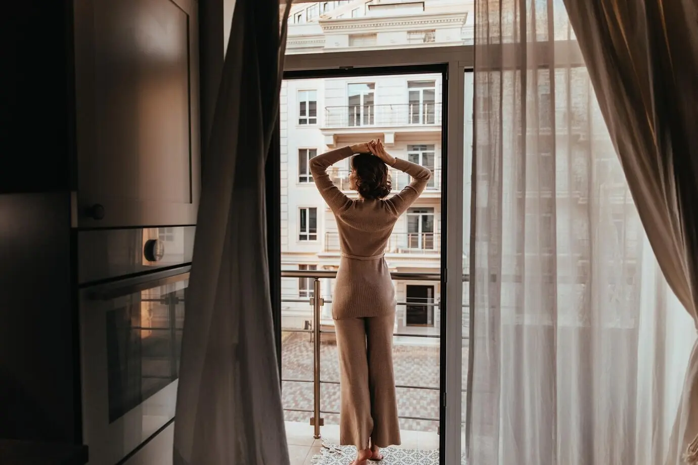
Cool greens and dusky blues can relax pulse and regulate breath, yet on silk they gain surprising warmth from reflected light and layered weaves. Test restful palettes on satin, charmeuse, and dupioni to see how texture alters perception. Notice how gentle luster turns somber hues alive at twilight, transforming stillness into comfort rather than sterility. Let the material’s musicality guide soothing combinations that still feel emotionally present.
Undertones Decide What the Eye Believes
A gray with violet undertones feels like quiet fog, while a gray with green undertones whispers of moss and dew. Silk exaggerates these undertones through warp and weft, revealing secrets under warm lamps and cold daylight. Hold swatches against skin, wood, and metal finishes to catch unexpected shifts. When undertones agree across paint, textiles, and rugs, the room breathes more slowly, and you finally exhale without noticing.
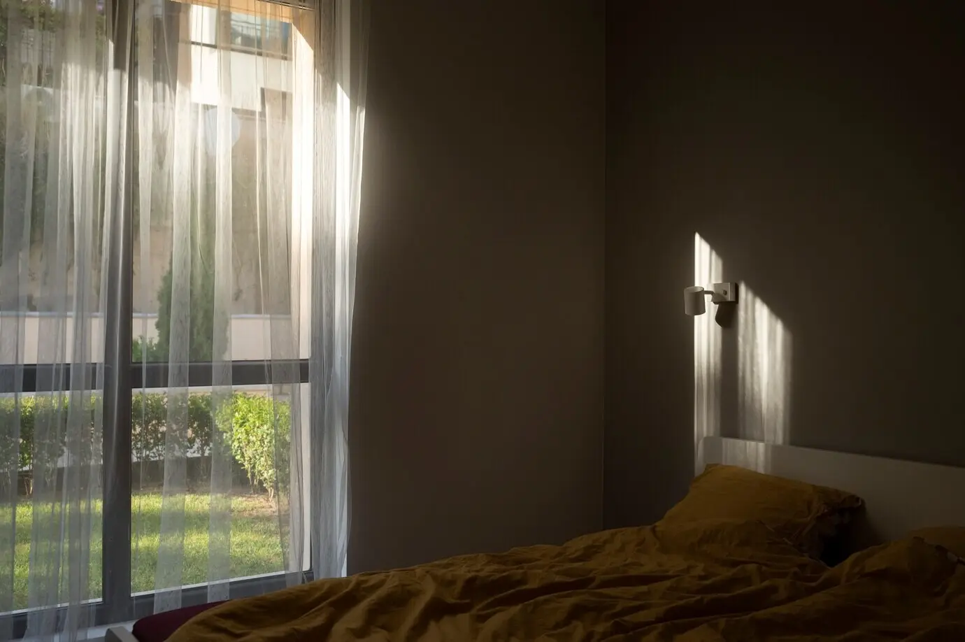
Swatching Rituals for Real-World Light
Tape large samples near the headboard and window, then live with them through sunrise, working hours, and evening. Place silk swatches beside bedding, lampshades, and mirror frames to gauge glow and shadow. Photograph at different times to capture how luster migrates. Invite a friend’s honest eye, then keep notes. After two days, your favorites remain calm, your uncertainties fade, and your palette begins speaking a language your body understands.